May, 2023
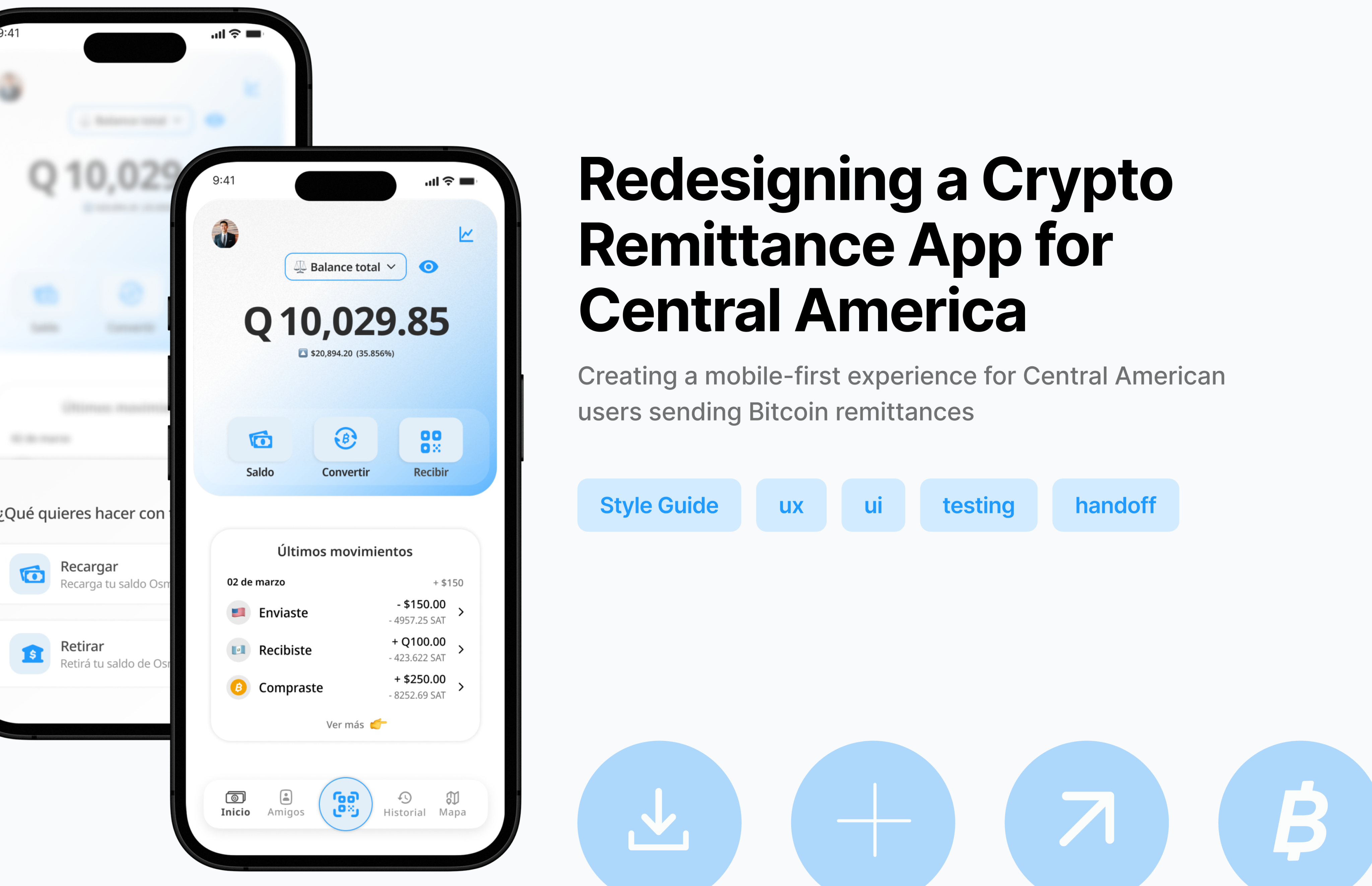
From QA to Lead Designer: Rebuilding a Bitcoin App for Central America
How earning trust through quality unlocked an unexpected design leadership role
CONTEXT
A Central American fintech was building a Bitcoin remittance app targeting a mobile-first, underbanked market in the region. The product existed — but it had accumulated inconsistencies, confusing flows, and conversion problems that were holding it back.
I came in through Singular Agency as a QA Lead. My job was to test, report, and get out of the way.
That's not what happened.
The Transition
As I ran usability and functional testing across the product, I wasn't just logging bugs — I was mapping the UX problems underneath them. Confusing onboarding. Drop-off in the send/receive flows. Visual inconsistency that undermined user trust at exactly the moments trust matters most: when someone is moving money.
I documented what I found clearly, with context and reasoning. The client noticed.
Midway through the engagement, they requested me specifically to take over the design role — replacing the existing designer that was leaving. It wasn't something I lobbied for. It was a direct result of how I work: I don't separate "finding problems" from "thinking about solutions."
⚠️ The name of the product and brand visuals have been anonymized due to client confidentiality.
CHALLENGE
The Problems
The product had three compounding issues:
Visual inconsistency — Typography, spacing, and color usage varied across screens without a clear system. In a fintech product, inconsistency reads as unreliability.
Flows designed for the wrong user — The send/receive and KYC flows assumed a level of crypto familiarity that most target users didn't have. The language was technical, the steps unclear, the error states absent.
Conversion drop-off — Onboarding and transaction initiation were losing users at predictable points. The friction wasn't accidental — it was designed in.
From this
To this
What I Redesigned
Working closely with the client and the development team, I tackled the product's highest-priority surfaces:
Onboarding & sign-up — Restructured the flow to reduce steps, clarify value early, and build trust before asking for sensitive information.
Send & receive flows — Simplified the transaction architecture. Removed ambiguity at every decision point. Added confirmation states and clear error handling.
Dashboard / home — Redesigned the main screen to surface what users actually need first: balance, recent activity, quick actions.
KYC / identity verification — Reframed the verification flow as a trust-building moment rather than a bureaucratic hurdle, using progressive disclosure to reduce abandonment.
Transaction history — Clarified information hierarchy so users could scan, understand, and act quickly.
“This project threw me into the deep end — and that’s exactly where I learned to swim as a product designer.”
Constraints I Worked Within
NDA limits what I can show, but the constraints that shaped the work are worth naming:
- Mobile-first, low-bandwidth context — design decisions had real performance implications
- High-trust requirements — every visual and copy choice had to reinforce security, not just functionality
- Existing tech stack — I couldn't redesign everything; I had to prioritise what would move the needle within what was buildable
- No dedicated research budget — insights came from QA data, client sessions, and my own heuristic analysis
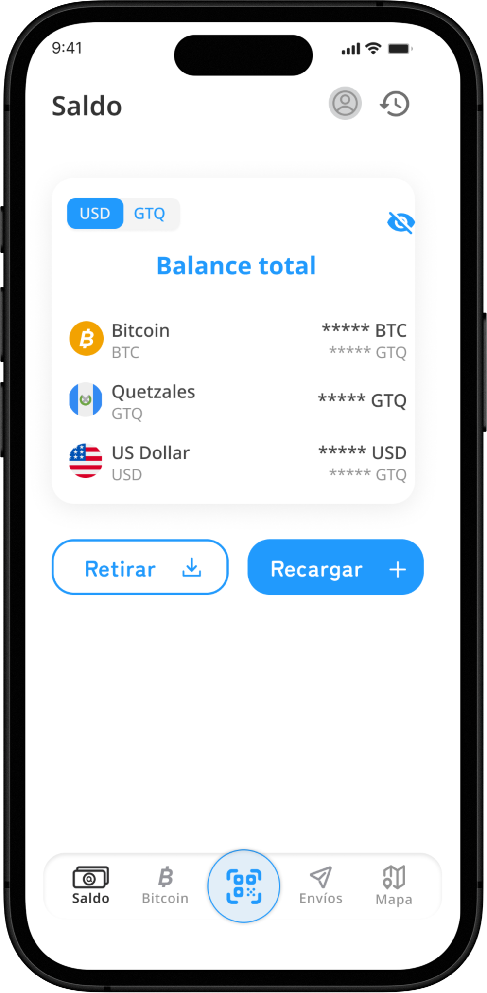
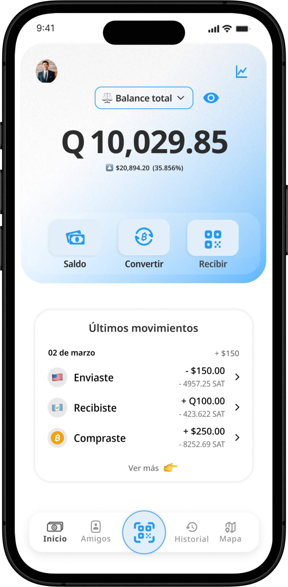
From busy to intuitive: simplifying the first touchpoint
The original UI was overloaded with competing elements — multiple balance displays, unclear hierarchy, and visual clutter that made core actions harder to spot. While the product offered powerful features, they were buried beneath inconsistent layouts and unnecessary friction.
before
after
In the redesign, I focused on:
- Clarifying visual hierarchy: the balance is now legible and prioritized, with supporting info minimized.
- Streamlining key actions: deposit, convert, and receive are front and center — no more guessing.
- Reducing noise: the layout is simplified, white space is used intentionally, and language is more focused.
These small shifts made the homescreen feel more trustworthy and intuitive — especially for users new to crypto.
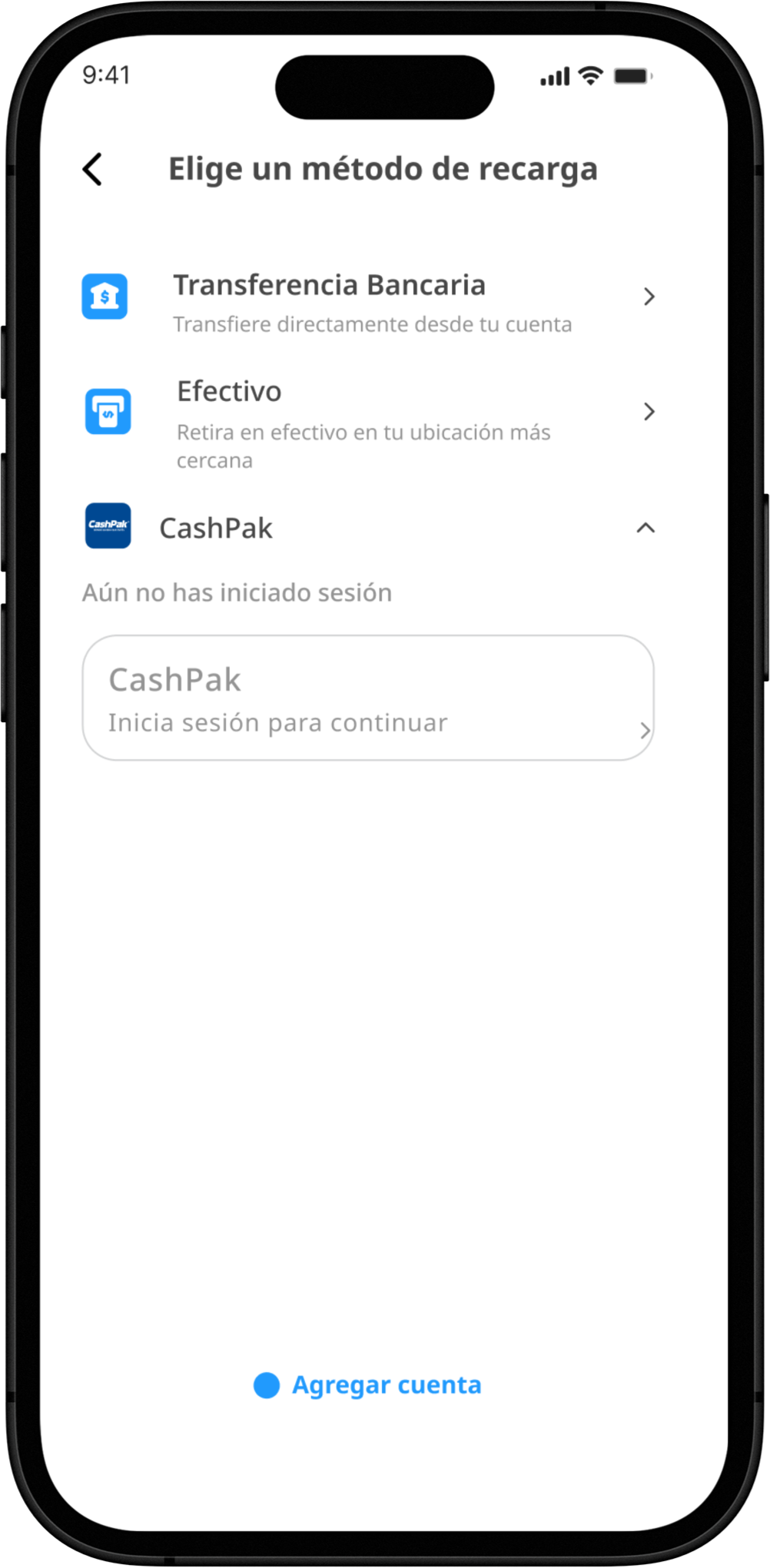
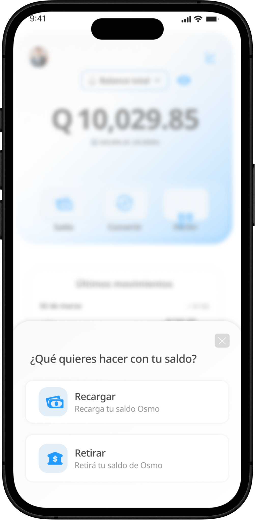
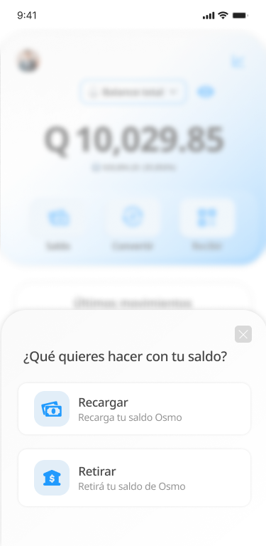
Designing the Recharge Flow: Turning Intent into Action
If the homescreen was the entry point, the recharge flow was the turning point.
This was the key moment where curiosity turned into commitment — when a user loaded money into their wallet and started their journey.
But the original experience made it hard to commit.
We saw drop-offs in early steps due to too many decisions upfront, unclear next steps, and an overload of information that created hesitation instead of confidence.
What we changed:
- Linear storytelling with overlays: We broke down the recharge process into a series of clear, focused steps using overlay screens. Each one explained a single concept or action, guiding the user naturally through the flow.
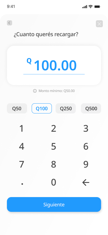
- Progressive disclosure: Instead of overwhelming users with forms and options all at once, we revealed only what was needed at each step — making it feel simpler and less risky.
- Reassurance through clarity: We rewrote labels, added inline feedback, and removed optional distractions to make each screen feel obvious and safe — even for users new to crypto or banking apps.
We weren’t just redesigning screens — we were building trust into every tap.
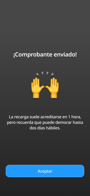
This shift had a measurable impact: fewer drop-offs, faster completions, and a clearer path to conversion.
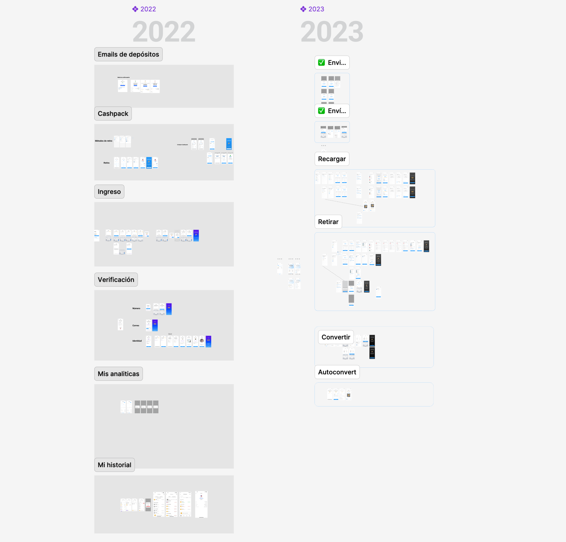
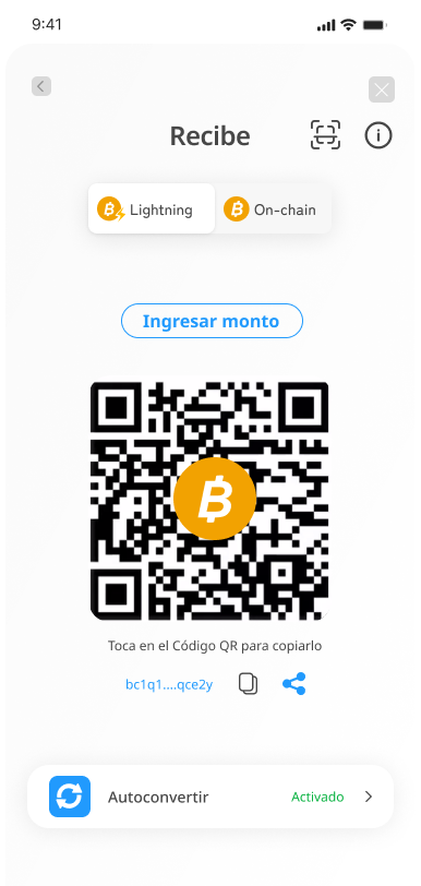
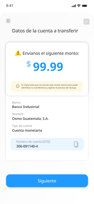
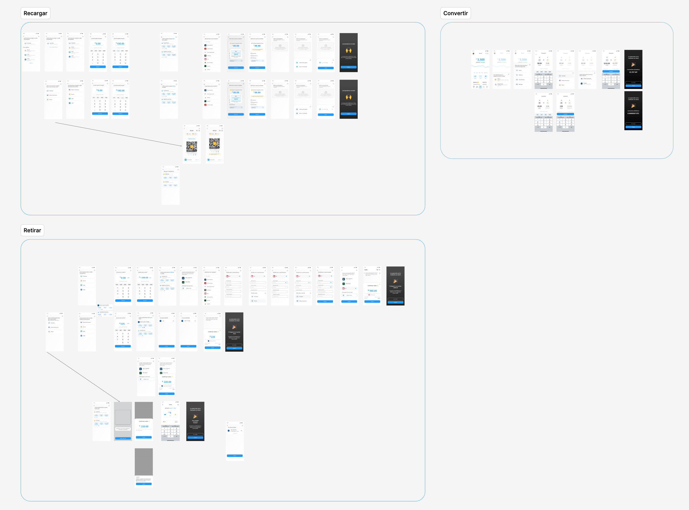
Bringing Clarity Across the Whole Money Journey
While the recharge flow was the most critical entry point, I also redesigned the key money movement flows across the app — including withdrawal, conversion, and auto-conversion.
Each of these followed the same design principles:
This meant:
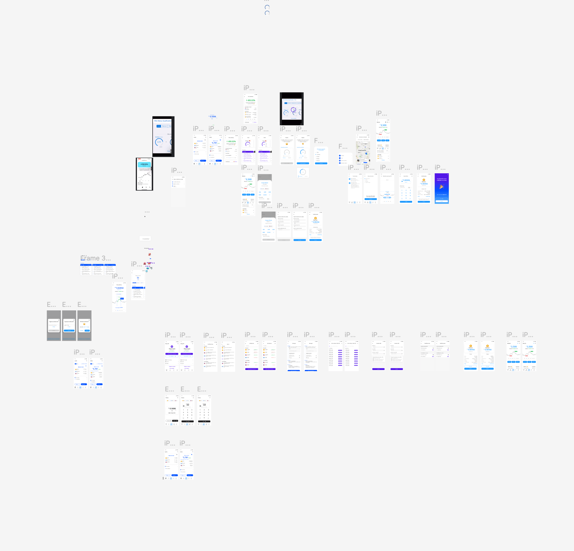
- Untangling a messy Figma file I inherited from the previous designer
- Reverse-engineering flows like recharge, withdrawal, and crypto conversion
- Creating a new visual language and style guide on the go
- Translating stakeholder requests into UX solutions, often without full context
The goal was to make every interaction — from cashing out to converting currencies — feel easy, safe, and trustworthy.
When I joined the project, the product had just launched and was still figuring out how to meet users where they were — in a region where crypto adoption was rising, but financial literacy was still low.
Our goal wasn’t just usability. It was translation. We were translating:
- crypto into real-world value
- friction into trust
- steps into stories
The design needed to feel like a conversation — not a challenge. We used simple language, progressive steps, and clear visual cues to turn intimidating financial actions into approachable ones.
In a space that often feels overwhelming, we aimed to make crypto feel almost playful — like something you could understand with just a few taps. And for many users, that was the difference between bouncing… and buying in.
Results
I didn't have access to post-launch metrics — the project continued after my engagement ended. But some things don't need a dashboard to measure:
The client replaced their designer with me based on the quality of my QA work alone. That's a signal. And the product shipped with a substantially more coherent, trustworthy interface than the one I inherited — one built around users who are moving real money in markets where trust is the product.
What I Took Away
This project taught me something I now treat as a core principle: the best way to earn design authority is to demonstrate it before anyone asks.
I didn't get the design role because I asked for it, I got it because I couldn't look at a broken flow without thinking about how to fix it — and I made that thinking visible.
In ambiguous, fast-moving product environments, that reflex is more valuable than any process.
This wasn’t a textbook case study. It taught me how to move fast, stay clear, and take ownership even in the messiest moments.
Tools Used
Figma · Miro · Hotjar · Design Systems · Mobile-first prototyping