June 27, 2025
Puro App
My First UX Project, revisited.
TL;DR
2020 me built a screens app. 2025 me tore it apart.
This is a retrospective on my first UX project — what worked, what didn’t, and how five years of product design changed how I think.
Back then, I approached it with enthusiasm, design theory, and lots of assumptions.Now, five years later — after working on real SaaS products, collaborating with devs, and understanding business context — I’m revisiting the project through a product lens.This isn’t a redesign. It’s a reflection on how I think now, and how I’d solve the same challenge today.
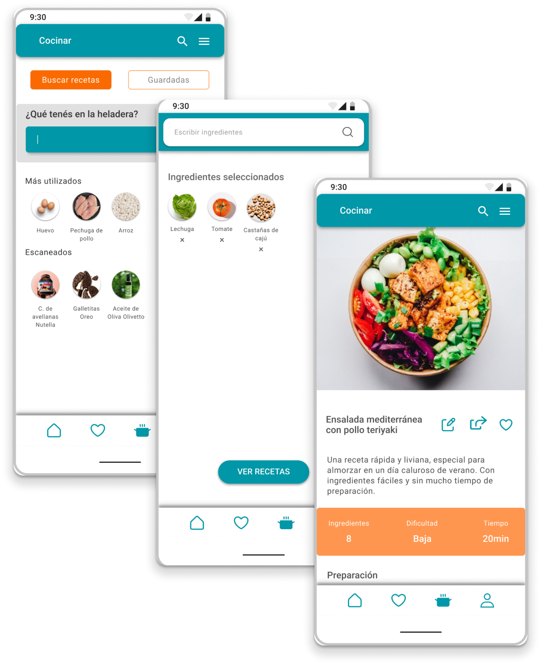
The Original Idea (2020)
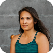
I designed this app back in 2020, during my UX course at Coderhouse.
The idea was simple: scan a food barcode and instantly know if it aligns with your health needs or dietary goals. At the time, it felt like solid UX. Looking back, I see it as a turning point — the moment I started thinking like a designer.
In 2025, I revisited the entire project with a fresh lens. Here’s everything I’d do differently today — and why it matters.

What I’d Do Differently (2025)
2020 me:
I focused too much on visual polish and screens.
2025 me:
I realized I never defined the actual problem. Users don’t want to “track food.” They want to quickly know if something fits their health needs — without reading tiny labels or Googling ingredients.
A tighter problem statement leads to a sharper product.


Ground the personas in reality
The original personas were built around lifestyle types (“urban wellness seeker,” “nature lover”) — more like Instagram archetypes than real users.
Today I would:
- Run quick user interviews
- Validate pain points like: label confusion, trust, price concerns
- Build behavioral archetypes based on motivations and actions, not vibes
“If I could give one piece of advice to my 2020 self, it would be: don’t force the MVP—let the insights guide the idea..”
Define a real MVP
I designed too much, too soon: tracking, education, community, search, and scanning. It was exciting, but scattered.
Now I’d define an MVP like this:
- Onboarding preferences (goals, skin type, food preferences)
- Product scanner with ingredient feedback
- Save favorite products to profile
- Optional: one tip per day based on scanned behavior
I’ve learned that clarity > complexity when launching a first version.
Design with metrics in mind
2020 me:
No success metrics, no hypotheses.
2025 me:
Product design needs goals.
“Users can scan and confidently save 3 products in under 5 minutes.”“80% of first-time users find value within the first session.”
Without outcomes, design decisions float. Today, I anchor everything to measurable impact.
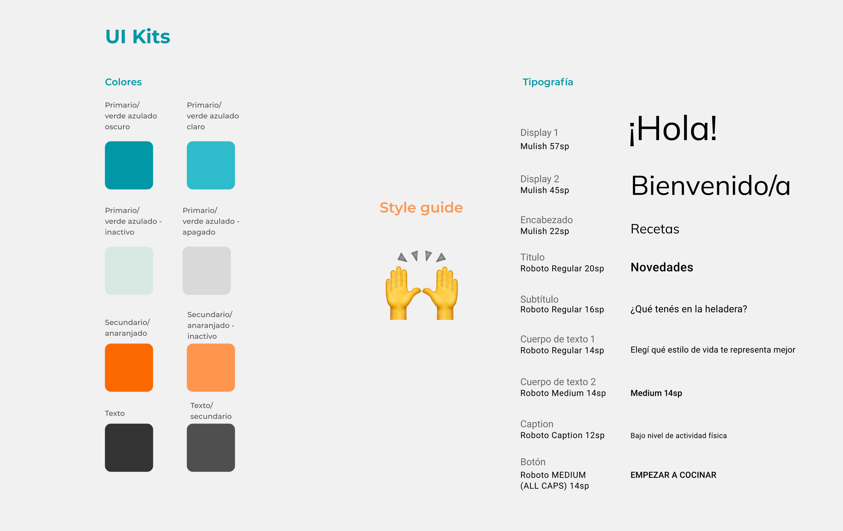
Visuals ≠ system
Visually, the app looked clean and friendly. But there was no design system — just intuition.
- Buttons had inconsistent spacing.
- Font sizes changed per screen.
- Color was used more for decoration than guidance.
Now I use layout grids, consistent spacing systems, and type hierarchies from day one — not to impress, but to communicate.
Simulate team thinking
Working solo, I never considered tech limitations, API constraints, or stakeholder feedback.
Today I would:
- Include dev constraints in scoping
- Simulate trade-offs based on effort vs impact
- Role-play a mini sprint plan with deadlines
- Flag areas where input from QA, PM, or marketing would shift priorities
This mindset shift — from “UX designer” to “product partner” — has been the biggest change in how I work.
A Full-Circle Moment
One of Puro’s core features was a barcode scanner — you could scan any wellness product in a store and instantly get information about ingredients and origin.
I now understand what it really takes to power a scanner: the data infrastructure, scanning logic, sync delays, UI latency, error handling — all the invisible complexity I once overlooked.
This wasn’t just a school project. It was the seed of the designer I’d become.
💬 Reflection
Puro App taught me how to design.Revisiting it taught me why I design.
I used to lead with screens.Now, I lead with questions, trade-offs, and measurable outcomes.This case study isn't perfect — but it’s honest.And that's the real value it holds today.
Tools used in this project
Figma | Miro | Google Forms | Illustrator